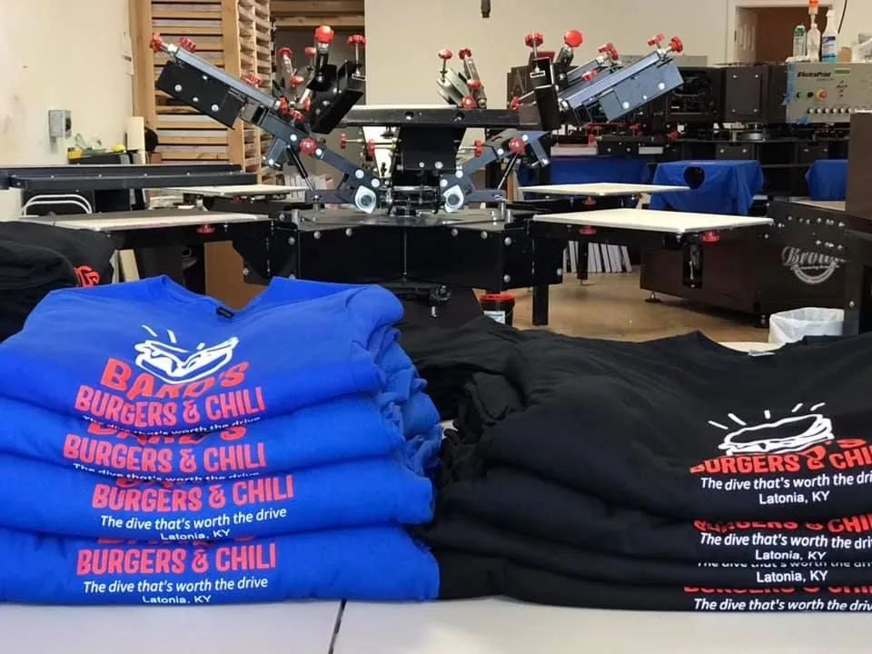
Creating printed materials that truly represent your brand begins long before the ink hits the paper or the vinyl is pressed. Whether you’re producing marketing materials, apparel, promotional items, or signage for events, clients, or internal branding,
When it comes to custom orders, speed isn’t just a bonus—it’s a necessity. Whether you’re organizing a corporate event, planning a sports ceremony, or creating personalized gifts, a fast turnaround can make the difference between a seamless success and a stressful scramble.
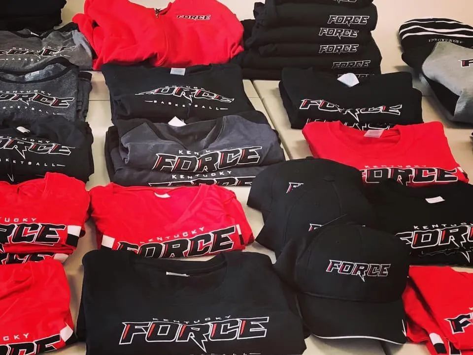
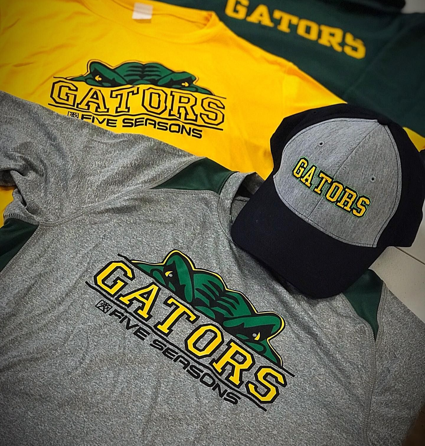
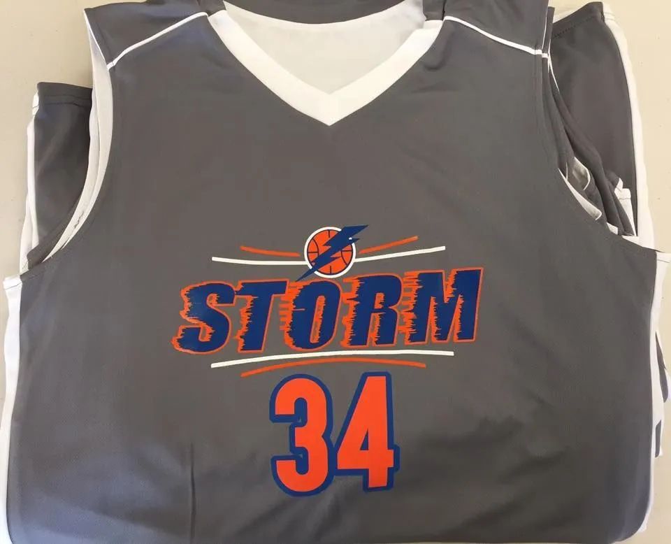
In today's competitive market, branding is everything, and custom apparel is one of the most effective ways to establish a strong and professional identity. Whether you're outfitting your team, promoting an event, or giving away merchandise,
Creating printed materials that truly represent your brand begins long before the ink hits the paper or the vinyl is pressed. Whether you’re producing marketing materials, apparel, promotional items, or signage for events, clients, or internal branding,
When it comes to custom orders, speed isn’t just a bonus—it’s a necessity. Whether you’re organizing a corporate event, planning a sports ceremony, or creating personalized gifts, a fast turnaround can make the difference between a seamless success and a stressful scramble.
In today's competitive market, branding is everything, and custom apparel is one of the most effective ways to establish a strong and professional identity. Whether you're outfitting your team, promoting an event, or giving away merchandise,