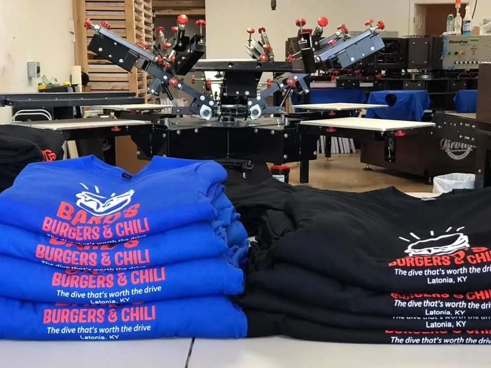
When it comes to custom orders, speed isn’t just a bonus—it’s a necessity. Whether you’re organizing a corporate event, planning a sports ceremony, or creating personalized gifts, a fast turnaround can make the difference between a seamless success and a stressful scramble.
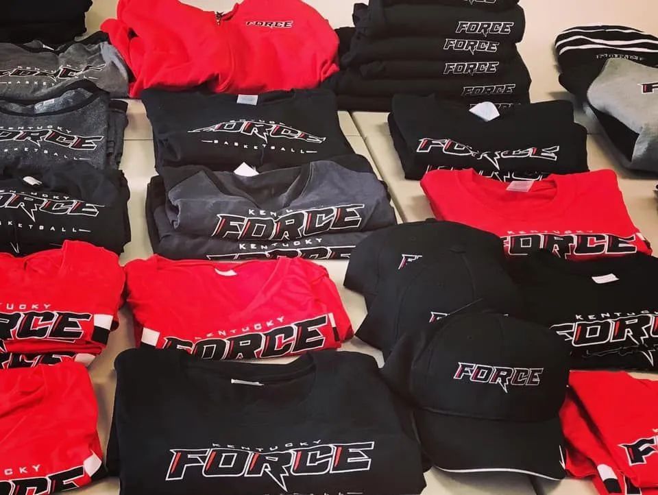
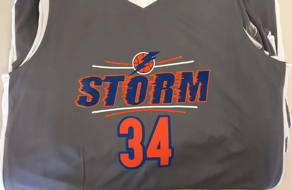
In today's competitive market, branding is everything, and custom apparel is one of the most effective ways to establish a strong and professional identity. Whether you're outfitting your team, promoting an event, or giving away merchandise,
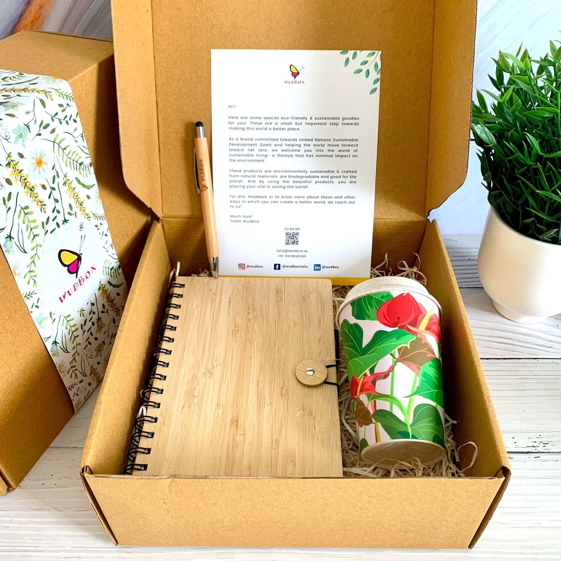
In today’s fast-paced world, where experiences are increasingly prioritized over material goods, personalized gifts have become a heartfelt way to add meaning to any occasion. Whether it’s a corporate event, a wedding, a graduation, or a sports ceremony,
When it comes to custom orders, speed isn’t just a bonus—it’s a necessity. Whether you’re organizing a corporate event, planning a sports ceremony, or creating personalized gifts, a fast turnaround can make the difference between a seamless success and a stressful scramble.
In today's competitive market, branding is everything, and custom apparel is one of the most effective ways to establish a strong and professional identity. Whether you're outfitting your team, promoting an event, or giving away merchandise,
In today’s fast-paced world, where experiences are increasingly prioritized over material goods, personalized gifts have become a heartfelt way to add meaning to any occasion. Whether it’s a corporate event, a wedding, a graduation, or a sports ceremony,